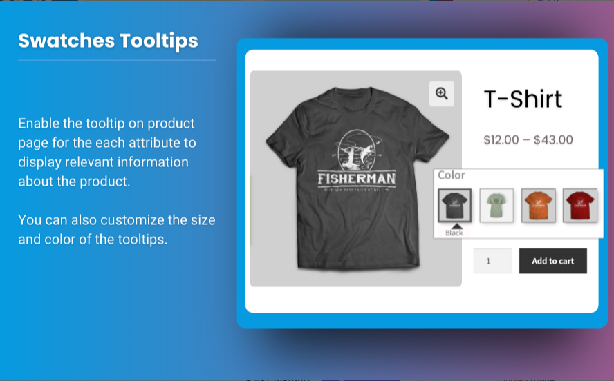
When running an online store, the way you present your products can significantly impact your sales. For many customers, having to choose between multiple variations of a product—such as size, color, or material—can sometimes become confusing or time-consuming. WooCommerce product variations swatches offer a visual solution to this problem by allowing customers to see product options in a much more intuitive, visual manner.
By optimizing your WooCommerce variation swatches, you can not only improve the user experience but also boost sales and reduce cart abandonment. This article will guide you on how to implement and optimize WooCommerce product variations swatches, the benefits of using them, and how to ensure they work seamlessly with your store’s design.
What Are WooCommerce Product Variations Swatches?
WooCommerce product variations swatches are visual representations of the different options available for a product. Instead of showing a traditional dropdown menu for color, size, or other variations, swatches provide a more user-friendly and visually appealing way for customers to choose between options.
For instance, instead of a dropdown that says “Color: Red, Blue, Green,” a swatch could display colored buttons or images representing the different color choices. This approach makes it easier for customers to see all the available options at a glance, helping them make quicker and more confident purchasing decisions.
Why Are WooCommerce Variation Swatches Important?
The benefits of using WooCommerce variation swatches are clear: they improve the shopping experience and ultimately contribute to better sales performance. Here’s how:
- Improved User Experience: Visual options like color and texture swatches provide a more engaging and intuitive shopping experience. This reduces friction in the decision-making process and encourages customers to make faster purchases.
- Increased Engagement: When customers can see product options visually, they are more likely to engage with the product and explore variations. This often leads to more purchases as customers are presented with clear, easy-to-understand choices.
- Reduced Cart Abandonment: When customers understand product variations easily, they’re less likely to abandon their carts. Swatches help streamline the selection process, reducing any confusion that may lead to frustration.
- Better Mobile Experience: Swatches are particularly beneficial for mobile shoppers who may find traditional dropdown menus hard to navigate on smaller screens. Swatches can be displayed in a more touch-friendly format, making them a great tool for mobile optimization.
How to Optimize WooCommerce Product Variations Swatches for Better Sales
Optimizing WooCommerce product variations swatches goes beyond simply adding them to your website. To get the most out of swatches and truly boost sales, you need to consider several key factors in their design, implementation, and functionality.
1. Use Clear, High-Quality Images for Swatches
One of the most important elements of an optimized swatch is the image or color that represents the variation. High-quality, clear images ensure that the customer can clearly see the difference between options. This is especially important for products with subtle color variations or patterns, such as clothing or furniture.
For example, if you’re selling clothing with various colors, make sure the swatch image accurately represents the color. This reduces the chances of the customer choosing the wrong option and helps build trust in your product quality.
2. Display Multiple Swatch Types
Different products require different types of variations. Depending on your product, you may have more than just color options, like size, material, or design. WooCommerce variation swatches allow you to display not only color swatches but also swatches for size, texture, or patterns.
- Color Swatches: For products that come in multiple colors, displaying a color swatch gives customers a clear, visual choice.
- Image Swatches: For products with patterns, textures, or designs (like fabrics or prints), image swatches work better than color swatches to provide an accurate visual representation.
- Label Swatches: When the variation is based on something like material or flavor, label swatches with text like “Cotton” or “Vanilla” can work well.
By displaying multiple swatch types, you offer customers a more complete and satisfying product selection process, which can lead to increased conversions.
3. Ensure Proper Alignment and Spacing
It’s essential that your WooCommerce product variations swatches are properly aligned and spaced to maintain a clean and easy-to-read layout. If the swatches are too close together, it can confuse customers and make the shopping experience feel cluttered. If they’re too far apart, customers may miss the available options entirely.
Proper alignment ensures that customers can easily see all the available options at a glance. Ideally, swatches should be displayed in a horizontal or grid layout where each variation is clearly identifiable. This minimizes the need for customers to scroll or navigate through long lists.
4. Use Interactive Features for Better Engagement
To make your swatches even more effective, consider adding interactive features such as hover effects, pop-ups, or tooltips. This can add an extra layer of engagement, giving customers more information about each variation.
For example, when a customer hovers over a color swatch, you could show a larger image or a tooltip explaining the material or the fabric type. This helps build confidence in the choice they’re making, making it easier for them to decide to purchase.
5. Add a Clear Call to Action (CTA)
Once your customer has selected their preferred variation, it’s essential to guide them toward the next step—adding the product to the cart. A sticky “Add to Cart” button or a prominent CTA helps encourage the user to take action quickly. Make sure the CTA is clearly visible next to the swatches and is easy to click.
6. Integrate with the Mini Cart for WooCommerce Plugin
One of the most effective ways to optimize the customer experience further is by integrating the mini cart for WooCommerce. This plugin allows customers to view their cart items without leaving the page they’re on, providing a seamless shopping experience. When paired with WooCommerce variation swatches, the mini cart offers instant feedback, allowing customers to see their selected variations in real-time.
7. Optimize for Mobile Users
As more customers shop on mobile devices, it’s crucial that your WooCommerce variation swatches work seamlessly on smaller screens. Ensure that your swatches are touch-friendly, easy to click, and mobile-optimized. Consider the following best practices:
- Make swatches large enough to tap on mobile devices.
- Ensure images are responsive and scale well on smaller screens.
- Optimize loading times by compressing images without sacrificing quality.
8. Test and Monitor Performance
Once you’ve set up and optimized your WooCommerce product variations swatches, it’s important to monitor their performance. You can use tools like Google Analytics or heatmaps to track customer behavior, seeing how many visitors interact with the swatches and how they affect conversions.
Testing is key to understanding which variations are the most popular and where customers may be dropping off. With this data, you can fine-tune your strategy to make adjustments that further improve your sales.
9. Use Extendons for Advanced Customization
For advanced customization and additional functionality, consider using Extendons, a powerful plugin that offers a range of features to improve WooCommerce product variations swatches. This brand provides tools that allow you to create dynamic, interactive product swatches with custom design options, better mobile optimization, and enhanced integration with other WooCommerce features like the mini cart.
Check out the useful insight about the sticky add to cart to enhance your store’s shopping experience!
FAQs
1. What are WooCommerce product variations swatches?
WooCommerce product variations swatches are visual representations (such as color, texture, or size) of a product’s different variations, helping customers easily choose their preferred option without using a dropdown menu.
2. How do I optimize WooCommerce variation swatches?
To optimize WooCommerce variation swatches, ensure they are high-quality, clearly displayed, mobile-friendly, and provide interactive features such as hover effects and tooltips. You can also integrate them with the mini cart for WooCommerce to enhance the user experience.
3. Can I use WooCommerce variation swatches on mobile?
Yes, WooCommerce variation swatches can be optimized for mobile by ensuring they are touch-friendly, responsive, and easy to navigate on smaller screens.
4. How does the mini cart for WooCommerce improve my swatches?
The mini cart for WooCommerce allows customers to view their selected product variations in real-time without leaving the page, improving the overall shopping experience and helping to boost conversions.
5. How can Extendons help with my WooCommerce product variations swatches?
Extendons provides advanced customization options and additional functionality for WooCommerce product variations swatches, helping you create a more dynamic and interactive product display for your customers.
Conclusion
Optimizing WooCommerce product variations swatches is one of the most effective ways to improve your store’s user experience and drive more sales. By making product options easier to understand and visually engaging, you reduce confusion and help customers make faster decisions. Key strategies like using high-quality images, ensuring proper alignment, adding interactive features, and integrating with tools like the mini cart for WooCommerce will help you get the most out of your swatches.
With the right setup and tools like Extendons, you can create a seamless, optimized shopping experience that encourages customers to explore more products and, ultimately, make more purchases.


